I think what I like best about this job is being exposed to things that are mostly foreign to me. When Polly Solomon came to me looking for a website and logo for her new endeavor, I learned a lot about the world of circus performers. The big thing — and the issue she is trying to correct — is that it is very difficult and expensive to break into the world of circus performance. Especially in the United States, as the majority of circus training for adults is overseas.
So that, inherently, means the “tent flaps” are closed to all but a fairly elite, homogeneous group. As I thought about this and looked around the web for inspiration on circus imagery (lots of elephants and stripes and clowns), it seemed like this circus tent imagery would work best.
The Logo
Rule number one for logos: one simple message that can be understood at a glance and at any size. If the Circus World is represented by the tent (which makes sense), then you might say that YACAMP is opening that tent to more people.
Because the circus tent is pretty instantly recognizable, I went to work trying to determine how little I could draw to communicate “circus tent.”

The Website
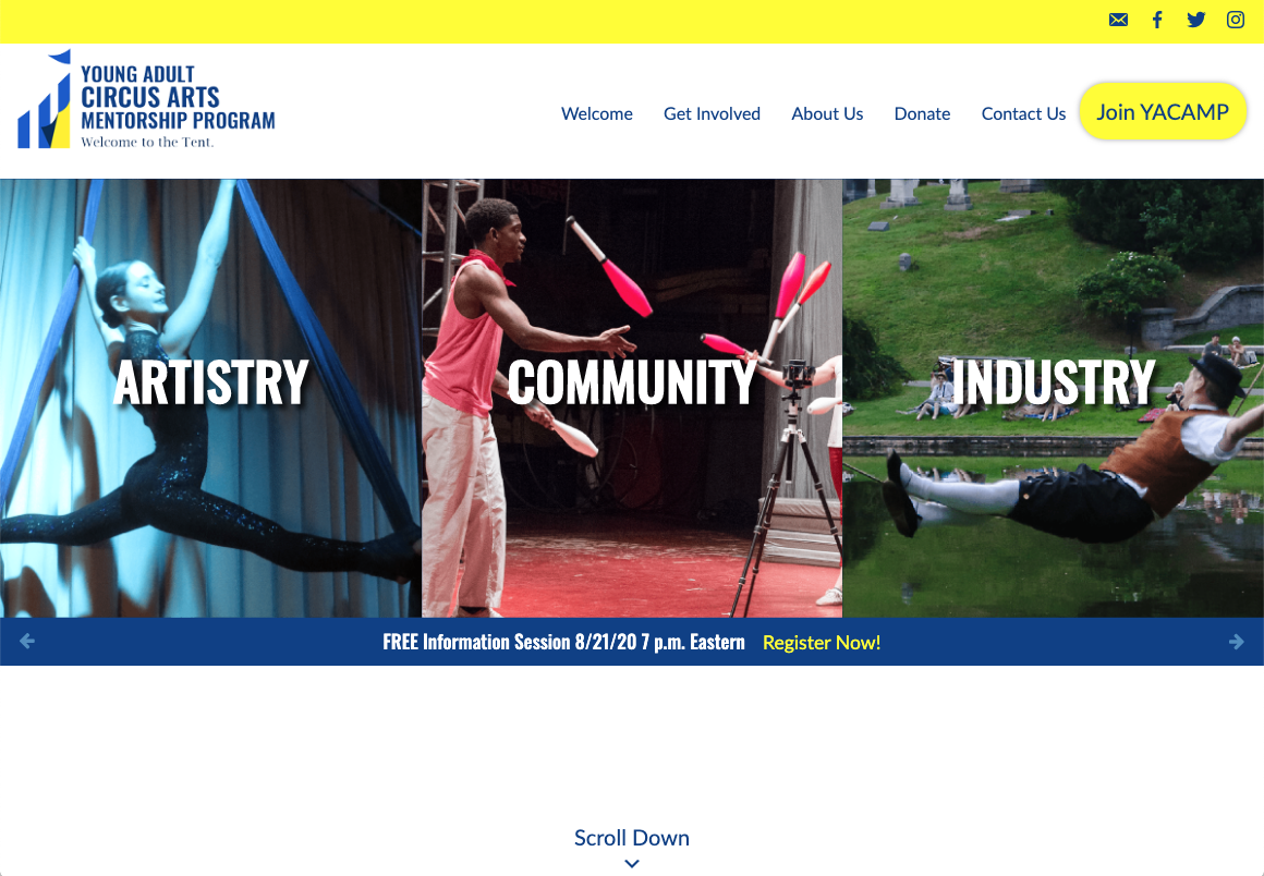
The core tenets of YACAMP are simple: improve craft, build community and connect with working professionals in order to understand how the industry works and where the opportunities are.
Of course, this is circus, so the site has to move. Because time was of the essence to prepare for the September session — and to be mindful of varying connectivity and browser capability — I kept it simple.
By adding simple scroll effects using CSS animation and jQuery to add classes when a new section enters the screen. Very lightweight (meaning it will load pretty quickly), very stable, but with a sense of motion and energy that the site needs.
